Thursday, November 10, 2011

Goodbye Mobile Flash, Hello HTML5

HTML5 wins, in the end, as Adobe acknowledges that the standard is better for video playback on the web. Mobile Flash development closes up shop after the next release.


Today marks the beginning of the end for Adobe Flash. Adobe has announced that it plans to discontinue Flash for mobile devices after the release of 11.1 because HTML5 is, quite simply, better. The promised Flash experience for mobile never matured beyond half-baked video playback, and Apple's refusal to adopt the format has pushed Adobe into acknowledging HTML5 as the future of video and interactive design on the web.
Continue to the full article..

Tuesday, September 20, 2011

Yes, I do lose sleep over this.

These "retina class" displays are coming, and all our work will look like cute, little, easy-bake-oven-mini-sites on these big displays. I don't wanna be the one yelling "Teh sky is falling!!!" ... but, um...

Ivy Bridge to Support Ultra High Resolution 4096x4096 Screens

Monday, September 19, 2011

The Guide To CSS Animation: Principles and Examples

With CSS animation now supported in both Firefox and Webkit browsers, there is no better time to give it a try. Regardless of its technical form, whether traditional, computer-generated 3-D, Flash or CSS, animation always follows the same basic principles. In this article, we will take our first steps with CSS animation and consider the main guidelines for creating animation with CSS. We’ll be working through an example, building up the animation using the principles of traditional animation. Finally, we’ll see some real-world usages.


Full Article

Thursday, September 8, 2011

Amen.

Must read from Khoi Vinh.
Money quote:
"Digital media requires something different, though. It’s not sufficient to just publish a narrative to the Internet. You have to build an experience around it, a system that lets the user experience the narrative but also one that responds to his or her inputs and contributions. Basically, to create anything meaningful in digital media, you need to think in terms of a product, not just a story."
- dp (via the Mullen)

Wednesday, July 27, 2011

What Web Designers Can Learn From Video Games

Games are becoming more Web-like, and the Web is becoming more game-like. If you need proof of this, you have only to look at Yahoo Answers. Random questions are posed, the top answer is chosen, and credibility points are given to the winner. It’s a ranking system that accumulates and unlocks more and more features within the system. It works because of the psychology of achievement and game mechanics and thus encourages interaction. This raises the question, what can a Web designer learn from games, or — more specifically — video games?

Good game interfaces have to be highly usable and intuitive, capable of handling a lot of repetitive actions in the fewest clicks possible. They need to be attractive and engaging. They need to be likeable. A good game interface adds to and enhances the user’s experience. In a game, people want the content delivered to them in a way that doesn’t break the fantasy. Any dissonance with the interface will cause an otherwise great game to fail.


Even in older games, as in Prince of Persia (displayed above), the limited system capabilities enforced designers to come up with creative and innovative design patterns. With more capabilities available today, we are able to find more advanced design techniques in modern video games.

In the same way, website users want their content delivered to them in a way that is easy to understand, intuitive and engaging and that doesn’t require a lot of scrolling or clicking. In fact, Web designers can learn a lot from video game interfaces. Websites that use common game interface tools can streamline the user experience while adding a lot of personality. This can result in higher traffic and a higher rate of repeat visits — and sales… Cha-ching!

It’s no surprise, then, that we’ve seen an influx of carousels, lightboxes, accordions and increasingly sophisticated navigation patterns, as CSS and JavaScript libraries have put such tools within reach of Web browsers. Whether it’s a good or a bad thing, is a topic for another article, and this article will focus on the techniques rather than their wrong applications.

What a Web designer can learn from video games isn’t limited to the user interface. Yahoo Answers works because of the psychology of the achievement system that is built in. So, while we will look at some basic user interface ideas and patterns, other higher-level concepts would be useful, too, and worth exploring.


Remember The Big Picture

In considering game interfaces, a Web designer needs to be acutely conscious of their project’s context and their client’s goals. Obviously, a website will often, though not always, have a goal that is very different from that of a video game. On many websites, efficiency needs to be a higher priority than entertainment. A cool fish-eye interface is not the most practical idea for a website dedicated to delivering tax information quickly or for an e-commerce website. However, an interactive social media channel might benefit from a leaderboard or some type of achievement system. Choose your UI components to fit the project.

Looking at the big picture, also consider structure and method — not just UI components. For example, look at how menus are structured, and consider why those choices were made. In many games, you have a hub-and-spoke type architecture, leading to different sets of tools within the menus. If you choose “Weapons,” then all of the options for weapons open on the next screen. You have to navigate back to the top screen in order to choose “Maps.” This structure simplifies a set of options that would otherwise quickly become confusing or overwhelming by providing focused attention on one choice at a time.

Can you see how this type of architecture could benefit a website that presents a large amount of information to the visitor? By allowing the visitor to focus on one piece of a large online task or one nugget of information at a time, you potentially increase the conversion rate for your client. This structure could also be effective when you are crafting a sales funnel on a website. The example below shows a simple game menu structure that could easily be applied to the information architecture of a website, building paths for visitors to follow.


If you were building a website for a CPA firm, you might segment its menu information under headings relevant to the type of visitor. A high-wealth individual has very different needs than a small business, but both might be interested in hiring the same firm. You could start at the top level, with two simple entry points serving as a funnel, one for individuals and families and the other for businesses and organizations, each button leading to the hub for that user. This hub page could provide content, offer pertinent tools and advertise relevant services for these very different users, thus simplifying their experience.


Read Full Article Here

Tuesday, July 19, 2011

10 Helpful Tools & Apps for Twitter Power Users

Twitter continues to grow its userbase at a crazy pace of over 460,000 new users each day. I found that as this means an increase of followers and conversations, it also increases the noise a lot. Fortunately, lots of tools out there help us to cut through the noise and get to the most useful bits and pieces. Here are 10 of my favourite tools to use Twitter more efficiently:


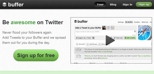
Buffer – Never Flood Your Followers


View the Twitter app website


One important part I found is to never overwhelm my followers. With Buffer, I can put Tweets into my “Buffer” and the App spreads them out over the whole day. With the handy browser extensions (Chrome, Safari or Firefox) I can add Tweets to it from anywhere on the web. This makes it very easy to become a great source of content for my followers and jump in to chat with them.

Best bit: What I like best is that for every Tweet Buffered, I will get detailed stats on clicks, retweets and reach to know more about what my followers like.


Tweriod – Tweet only when others listen


View the Twitter app website


More after the break...

Wednesday, July 13, 2011

The Heritage Of Berlin Street Art And Graffiti Scene

Art critic Emilie Trice has called Berlin “the graffiti Mecca of the urban art world.” While few people would argue with her, the Berlin street scene is not as radical as her statement suggests. Street art in Berlin is a big industry. It’s not exactly legal, but the city’s title of UNESCO’s City of Design has kept local authorities from doing much to change what observers call the most “bombed” city in Europe. From the authorities’ point of view, the graffiti attracts tourists, and the tourists bring money to a city deep in debt.


This article looks at the development of the Berlin street art scene, from its beginnings as a minor West Berlin movement in the late ’70s to its current status: the heritage of a now unified city.

The Development Of The Berlin Graffiti Scene
After the few East Germans who crossed the Berlin Wall in the ’80s blinked and pinched themselves, what do you think was the first thing they saw?

They saw big bubbly letters, spelling out words in German, English and French. They saw political slogans, either carved indelibly into the concrete or sprayed temporarily onto surfaces, commenting not only on the situation in Germany, but on the whole political world: “God Ble$$,” “Concrete Makes You Happy,” “Death to Tyrants.” As far as they could see, covering every inch of wall, was layer upon layer of zest, life and color.

Full Article

Monday, June 27, 2011

Facebook ROI


Recently there have been a lot of really great articles on Return on Investment in Social Media Marketing. As the industry grows, market researchers are finding that investing in Social Media is paying off big for businesses. What used to be an experimental marketing technique has now become a highly valuable marketing channel for organizations of all shapes and sizes.

- Marketing to your Facebook Fans can reduce the acquisition cost of registrations by 44%, event signups by 33%, and purchases by 15%. (http://bit.ly/jFPyDW)

- A Facebook Fan is worth 20 visits to your website per year (http://bit.ly/jk0sQh)

- 62% of people that Like a page would buy from it, 20% conversion rate of shares to sales (http://bit.ly/iHwVMO)

Thursday, June 16, 2011

hashtag—you're it.


Important points about the humble hash.

- DP Knudten

thx: Brian Solis (who is rapidly becoming my favorite social media blogger). Find him @ briansolis.com.

Monday, June 6, 2011

Gliffy - Great looking online diagrans for free


Built for the demands of more intense users, only Gliffy Premium makes it this easy to create, share, and collaborate visually with colleagues, vendors, clients, and organizations.


Thursday, June 2, 2011

Website reality


How great is your idea? Only as great as your ability to execute it.


- D.P. Knudten

as seen on mashable

Tuesday, May 24, 2011

Building An Effective ‘Coming Soon’ Page For Your Product


I recently had to design a couple of teaser pages for a client and a personal project, and this led me to think about what exactly makes for a good teaser page — or to be more precise a “coming soon” page that companies often put up before they’re ready to launch their product. After careful research and many scientific tests in the brand new field of teaserology, I’ve developed a patented Teaser Effectiveness Analysis Matrix™, consisting of four elements. The perfect teaser page must score high on all four axis of the following:

  • Memorability,
  • Virality,
  • Desirability,
  • Data collection-ability.

I know that “data collection-ability” is not proper English, but inventing new words is one of the perks of being a scientist. As we’ll see, most teaser pages focus strongly on two or three of these elements but rarely hit all four.


Friday, May 13, 2011

Manifesto: The Future

Interesting (albeit a bit lengthy) read. Author Adam Wohl shares his philosophies about mobile and emerging technologies, and how their importance will inform the way the most successful advertising agencies will be constructed in the future.

Source: The Chicago Egotist

Thursday, May 12, 2011

Welcome our new intern!

Discover-ers,

Please, if you haven't already met, introduce yourself to Jason Riehl - our newest addition to the interactive division. He's a 4th semester MMI student interning here primarily assisting with DW banner ads.

Welcome Jason!

Monday, May 9, 2011

When is a picture worth > 1000 words?

Interesting sorta-still treatment for photography.


Could be very cool, and lightweight, for interactive applications.

- D.P. Knudten (xposted at DMW•Discover)

(thx to Tom Cranley @ Roman Candle)

Monday, April 18, 2011

9 Gadgets That Smartphones Made Obsolete

Cameras and landlines are obvious, but check out some of the other gadgets that smartphones have made obsolete. Personally, my iPhone has replaced every single thing on the list.

Thursday, April 7, 2011

Collection of the most important jQuery user-interface components for modern websites

jQuery Tools is a collection of six different, equally amazing tools for you to use in your website. These include the brilliant Scrollable, which makes scrollbars a thing of the past.

More info

Friday, April 1, 2011

HTML5 Gallery

Found this HTML5 gallery with lots of sites taking advantage of the latest HTML5 + CSS trickeries.


No, REALM isn't listed...yet.

Google introduces new Gmail Motion!!!

Thursday, March 31, 2011

What's at Stake for Mozilla with Firefox 5's Rapid Release

What’s this? A preview of Firefox 5 available already? Technically labeled 4.2a1pre, ConceivablyTech reports this embryonic browser is none other than Firefox 5 at its earliest point. And since Mozilla is moving forward with its [new] 16-week development process, now dubbed Rapid Release, we’re 3-4 months away from an official Firefox 5.0 successor to the browser that just launched last week.

Full article: http://www.tested.com/news/whats-at-stake-for-mozilla-with-firefox-5s-rapid-release/2089/.

Wednesday, March 30, 2011

Storytelling

Great commercial that tells the story without one word being spoken. Creates a lot of emotions without speaking one word. very cool.

Zippo: Heirloom, 60 second version from M. Keegan Uhl on Vimeo.

Tuesday, March 29, 2011

Foursquare 3.0 – So What?

Foursquare is stepping up its game with new features that make it an even bigger player in the social media arena. The two year old platform now boasts over 15 million venues and more than 1/2 a billion check-ins amongst it’s 6 million users. And it is definitely something we should be talking with our clients about.

Here's a breakdown on two of the new features – the Explore tab and new Specials and what they mean for the marketing professional.

Explore

The new Explore tab allows users to, wait for it, explore the area around them based on some different criteria. By selecting what you’re looking for, either by choosing a category and searching or by search alone, Foursquare will return a list of suggestions. According to the Foursquare blog, the list is compiled from a number of things:

  • Places you’ve been
  • Places your friends have been
  • Places that you are loyal to
  • The types of places you go
  • How popular each place is with all users
  • What day/time you are exploring
  • What tips each venue has
Foursquare then takes it one step further by showing you the reason why that particular place would be of interest (you've been to related places, your friends have been here, etc.).

So what? 
The most common question people asked me about the "old" Foursquare was "what's the point?" And beyond showing off where you've been and maybe some friendly mayorship competition, there really wasn't one. But people value good recommendations especially  recommendations that are tailored to their preferences, so this added functionality has the potential to draw a lot of new users. And an increase in new users will also increase the activity amongst existing users, meaning more users will see (and hopefully interact with) your company's Foursquare program.

New Specials

As I alluded to above, the key to Foursquare’s initial “mainstream” success was the Mayorship special that rewarded users for being the most frequent visitor to a particular venue. Now Foursquare has rolled out five new types of specials and a new interface to make the platform more valuable to businesses.

These new specials include:
  • Flash specials – The first 3 people to check in get X. A typical door buster deal.
  • Friends Special – check in with a certain number of friends and get X
  • Swarm Special – check in with a large enough “swarm” and everyone gets X. Different from a Friends Special in that the other users don't have to be your Foursquare friends.
  • Newbie Special – check in for the first time and get X. Great way for businesses to attract new customers.
  • Check-In/Frequency/Loyalty check-ins – Get X every time you check in/Check in Y amount of times in a week and get X/Check in X amount of times and get Y on your return visit, respectively.

So what?
There are now several more ways to get people in the door. These new specials allow for more creativity, and a really creative special can increase word of mouth buzz around your business. Plus, on the Places screen in the app, users now see a list of all the Specials nearby, so new customers are more likely to see your business's special and visit your venue.

The business end is also becoming more streamlined. Businesses will now have access to an analytics dashboard, which displays all of your information, gives you the ability to manage and run multiple specials at once, and allows you to track performance both during and after a special is run. Running and managing specials at a business remains free. With all the new options available and the ease with which a business can implement them, it’s likely that even more brands will come on board.

Monday, March 28, 2011

Once you go SVG you never go back.


Check this out, SVG graphics have been around a long time, but I've rarely seen them implemented because of Flash—but this is the first site I've seen that uses them heavily, and with great effect. They're using web fonts heavily as well. Disgusting(ly awesome).

Friday, March 25, 2011

Ads Worth Spreading

TED recently released it's Top 10 list of ads worth spreading - evidence that the success of an ad is no longer defined so much by its likelihood to make you purchase a product or consider a service, but by its talkability.


First of all I would argue that the goal should never be to make a viral video, because something can't be viral until it is, in fact, viral.

Second, if you're following the rules, you're doing what has been done before and ultimately being boring. If you create an ad or video that follows some pre-set formula, I can almost guarantee no one will pay attention to it, much less share it.

There is no one theme among these 10 videos that proves there are rules around viral ad success, other than they're all based off a cool/compelling idea. 

Bottom line? Focus not on getting shared, but on creating something worth sharing.

Here is one of the videos that made TED's Top 10 list.

Wednesday, March 23, 2011

HTML5/CSS Animation Examples

Here's a site I've been using as a resource to build simple CSS animations:


Now you know all my secrets. ;)

QR Code Generator

Here's the QR Code generating for Roman Candle Pizza:

You can output codes in multiple formats, even EPS. We're experimenting with these codes to see what we can all do to them creatively, and still have them work, using different colors, etc. It is possible to put the black over a color other than white and still have the code work.

Friday, March 18, 2011

Volkswagen - Test Drive in Interactive Print Ad

From Norway an augmented reality application that allows you to experiment a Volkswagen test drive by moving your iPhone over a print ad. The video that presents the initiative is very nice, the app itself is less cool than it could have been tough.


The marketing action is rather demanding to consumers in terms of attention (find the ad, make sure you own an iPhone, download the app etc...). However sometimes generating talkability could be more than enough especially in the over crowded automotive industry so, in the end, I like the idea :)

We Can Do Better: The Overlooked Importance of Professional Journalism

The Web is a galaxy of information that is rapidly expanding. Blogs and online magazines are helping shape the future of this Information Age that we live in. Those of us who read, write and design blogs and online magazines possess extraordinary power and potential. How will we choose to use it?

If you use your website to publish news, events, opinions or interviews, you should familiarize yourself with the basics of journalism. These tools can help us develop and share information that is exciting, intelligent, and responsible. They can provide guidance and support as you pursue a career or hobby writing online.

This article is accompanied by examples of photojournalism, which is the practice of communicating news through photographs. The above photo of a 1940′s newsstand in New York City was taken by photojournalist Ruth Orkin


We, designers, go on all day about the usability of our WordPress layouts and the readability of our typography, but all of those things have been considered in vain if our writing is poorly spelled, riddled with inaccuracies, or based on second-hand assumptions that will leave our audience misled, confused, or worse. Even if you’re just casually writing about why you personally love/hate the iPad (for example), you can do so in a truthful way (truthful to your own opinions and truthful to the information you are discussing).

Whether or not you strive to produce writing that you consider journalism is not all that important. What is important is that no matter what writing genre you specialize in, you have a responsibility to your readers to publish high quality writing that is truthful, accurate, and readable. Oh, and this applies to your professional Twitter stream and Facebook updates, too. All of these elements have a reflection on you and your brand.

Trained professional journalists spend years studying the complex techniques and thorny philosophical values that define the trade of journalism, so don’t expect to receive a Master’s degree from Columbia by the end of this article. What this piece can serve as is a crash course designed to introduce concepts that will improve your writing, pique your interest, and instill a sense of respect for the fundamentals of a noble profession.

What is Journalism?

The most familiar function of journalism is ‘hard news’ reporting you’ll see on the front page of the New York Times or the Washington Post. But journalistic writing also extends to editorial writing, cultural reviews, interviews, and more.

According to The Elements of Journalism (written by Bill Kovach and Tom Rosenstiel), “Journalism’s first obligation is to the truth.” Journalism is the pursuit of truth, accuracy and fairness in the telling of a story. Journalists serve and inform their audience by investigating and reporting on news, trends, issues, and events. Much like designers, journalists pride themselves on a duty provide their audience with useful, high-quality content.

What’s the difference between Journalism and Blogging?

CNN.com delivers journalism. Your cousin’s homemade Twilight fan fiction site, on the other hand, is a blog. However, somewhere in between lies a hotly debated grey area.

So can blogs be journalism? According to NYU journalism professor Jay Rosen, “They can be, sometimes.” How can you tell the difference? Depends on who you ask. Rosen himself is both journalist and blogger (he runs PressThink, a weblog about journalism and the press). In his essay ‘Bloggers vs. Journalists is Over’, Rosen decides that the sometimes indiscernible difference between these two forms of writing is less important than the implications of massive shifts of power in the media. Rosen acknowledges what Tom Curley (Chief Executive of the Associated Press) called “a huge shift in the ‘balance of power’ in our world, from the content providers to the content consumers.” What does that mean for those of us in a position to take advantage of our newfound power?

It means we should move forward with a spirit of responsibility and immense excitement. We live in a revolutionary time when just about anyone with access to a computer can make his or her writing available to an enormous international audience with the click of a button. As Web designers and online writers who are experienced with the Web, the potential of our medium is tremendous.

Journalistic Tools for Bloggers

This photo comes from a series chronicling Paris street dancers practicing dance styles including breakdancing and capoeira. This photo, by Denis Darcazq, was acknowledged by photojournalism foundation World Press Photo in 2007


Write Compelling Leads

A ‘lead’ is the first sentence of an article. The lead is your first and best chance to compel the reader to stick around and read more. A sentence that is humorous, provocative, or curious can be extremely engaging.

To learn more about captiving leads, you can’t beat the literary titans of fiction. One classic first sentence comes from Franz Kafka’s novella The Metamorphosis: “Gregor Samsa woke from uneasy dreams one morning to find himself changed into a giant bug.” Who wouldn’t want to know what happens next?

Use the Active Voice

The active voice is much more compelling than the passive voice. To say ‘I am designing the website’ is a clearer and more powerful statement than ‘the website is being designed by me.’ According to The Elements of Style, “The habitual use of the active voice… makes for forcible writing. This is true not only in narrative concerned principally with action but in writing of any kind.”

Full Article

Thursday, March 17, 2011

Why User Experience Cannot Be Designed


A lot of designers seem to be talking about user experience (UX) these days. We’re supposed to delight our users, even provide them with magic, so that they love our websites, apps and start-ups. User experience is a very blurry concept. Consequently, many people use the term incorrectly. Furthermore, many designers seem to have a firm (and often unrealistic) belief in how they can craft the user experience of their product. However, UX depends not only on how something is designed, but also other aspects. In this article, I will try to clarify why UX cannot be designed.

Full article here: http://www.smashingmagazine.com/2011/03/15/why-user-experience-cannot-be-designed/

Literal Mobile Marketing

Interesting video about the Good Food Truck in Atlanta and how it uses social media on the move. Would be awesome to build a similar reputation for the RC - where people look to them to find out what cool/fun stuff is going on in the neighborhood.