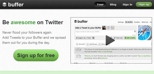
Good game interfaces have to be highly usable and intuitive, capable of handling a lot of repetitive actions in the fewest clicks possible. They need to be attractive and engaging. They need to be likeable. A good game interface adds to and enhances the user’s experience. In a game, people want the content delivered to them in a way that doesn’t break the fantasy. Any dissonance with the interface will cause an otherwise great game to fail.

Even in older games, as in Prince of Persia (displayed above), the limited system capabilities enforced designers to come up with creative and innovative design patterns. With more capabilities available today, we are able to find more advanced design techniques in modern video games.
In the same way, website users want their content delivered to them in a way that is easy to understand, intuitive and engaging and that doesn’t require a lot of scrolling or clicking. In fact, Web designers can learn a lot from video game interfaces. Websites that use common game interface tools can streamline the user experience while adding a lot of personality. This can result in higher traffic and a higher rate of repeat visits — and sales… Cha-ching!
It’s no surprise, then, that we’ve seen an influx of carousels, lightboxes, accordions and increasingly sophisticated navigation patterns, as CSS and JavaScript libraries have put such tools within reach of Web browsers. Whether it’s a good or a bad thing, is a topic for another article, and this article will focus on the techniques rather than their wrong applications.
What a Web designer can learn from video games isn’t limited to the user interface. Yahoo Answers works because of the psychology of the achievement system that is built in. So, while we will look at some basic user interface ideas and patterns, other higher-level concepts would be useful, too, and worth exploring.
Remember The Big Picture
In considering game interfaces, a Web designer needs to be acutely conscious of their project’s context and their client’s goals. Obviously, a website will often, though not always, have a goal that is very different from that of a video game. On many websites, efficiency needs to be a higher priority than entertainment. A cool fish-eye interface is not the most practical idea for a website dedicated to delivering tax information quickly or for an e-commerce website. However, an interactive social media channel might benefit from a leaderboard or some type of achievement system. Choose your UI components to fit the project.
Looking at the big picture, also consider structure and method — not just UI components. For example, look at how menus are structured, and consider why those choices were made. In many games, you have a hub-and-spoke type architecture, leading to different sets of tools within the menus. If you choose “Weapons,” then all of the options for weapons open on the next screen. You have to navigate back to the top screen in order to choose “Maps.” This structure simplifies a set of options that would otherwise quickly become confusing or overwhelming by providing focused attention on one choice at a time.
Can you see how this type of architecture could benefit a website that presents a large amount of information to the visitor? By allowing the visitor to focus on one piece of a large online task or one nugget of information at a time, you potentially increase the conversion rate for your client. This structure could also be effective when you are crafting a sales funnel on a website. The example below shows a simple game menu structure that could easily be applied to the information architecture of a website, building paths for visitors to follow.

If you were building a website for a CPA firm, you might segment its menu information under headings relevant to the type of visitor. A high-wealth individual has very different needs than a small business, but both might be interested in hiring the same firm. You could start at the top level, with two simple entry points serving as a funnel, one for individuals and families and the other for businesses and organizations, each button leading to the hub for that user. This hub page could provide content, offer pertinent tools and advertise relevant services for these very different users, thus simplifying their experience.

Read Full Article Here